Flexbox vs CSS Grid for Responsive Layouts: Which Should You Choose?

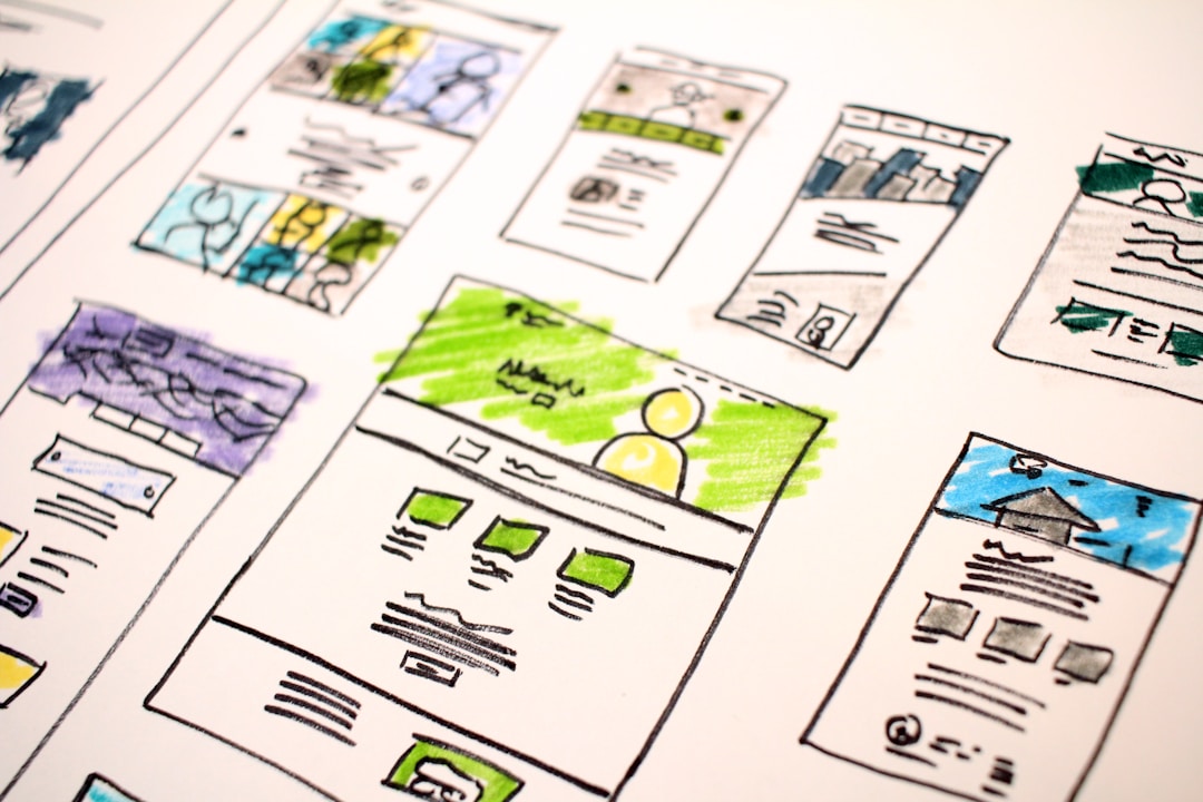
When I started building responsive layouts, I often confused Flexbox and CSS Grid. I’d use Flexbox for page-level layouts that really needed Grid, or add unnecessary complexity with Grid when Flexbox was simpler. Understanding when to use each method saves time and produces cleaner CSS.
Problem
I need to build a responsive page layout. I’ve written CSS with media queries for breakpoints, but I’m not sure which layout method to use. Should I use Flexbox? Grid? Both?
Environment
- CSS (modern browsers)
- Responsive website layout
- Media queries for breakpoints
The Core Difference
The simplest way to distinguish them:
FLEXBOX (One-dimensional)┌──────────────────────────────────────────┐│  [Item 1] → [Item 2] → [Item 3] → [Item 4]│  (items flow in ONE direction)└──────────────────────────────────────────┘              ↓         One axis: horizontal OR vertical
CSS GRID (Two-dimensional)┌────────────┬────────────┬────────────┐│  [Cell 1]  │  [Cell 2]  │  [Cell 3]  │├────────────┼────────────┼────────────┤│  [Cell 4]  │  [Cell 5]  │  [Cell 6]  │├────────────┼────────────┼────────────┤│  [Cell 7]  │  [Cell 8]  │  [Cell 9]  │└────────────┴────────────┴────────────┘         ↓            ↓    Row axis    Column axis    (Two axes at the same time)
Use Flexbox when content should flow in a single direction. Use Grid when you need to control rows AND columns simultaneously.
Flexbox: The Content-First Approach
Flexbox is “responsive by default”—items shrink or grow to distribute space:
.container {  display: flex;}
.item {  flex: 1; /* shorthand: flex-grow: 1, flex-shrink: 1, flex-basis: 0% */}
Each item takes equal space and adjusts when the container size changes:
Wide container:┌────────────────────────────────────────────┐│  [Item 1  ] [Item 2  ] [Item 3  ] [Item 4  ]│  (all equal width)└────────────────────────────────────────────┘
Narrow container:┌──────────────────────────┐│[I1][I2][I3][I4]│  (items shrink equally)└──────────────────────────┘
Flexbox works well for:
- Navigation bars (horizontal item distribution)
- Card lists (rows of items)
- Distributing space among siblings
- Aligning items within a container
CSS Grid: The Layout-First Approach
Grid lets you define a structure first, then place items into it:
.container { display: grid; grid-template-columns: 1fr 1fr 1fr; /* Three equal columns */}The fr unit distributes available space across grid tracks:
1fr = "one fraction of available space"
grid-template-columns: 1fr 1fr 1fr→ Each column gets 1/3 of available width
grid-template-columns: 1fr 2fr→ First column: 1/3, Second column: 2/3
Grid works well for:
- Page layouts (header, sidebar, main, footer)
- Complex component grids
- Precise 2D positioning
- Dashboard-style layouts
Responsive by Default
Both methods are responsive without media queries. MDN explains that modern layout methods “assume you’re trying to create a flexible grid and provide easier ways to do so.”
Items adjust automatically based on container size. I only add media queries when the layout structure needs to change at breakpoints:
/* Mobile: single column */.wrapper {  max-width: 960px;  margin: 2em auto;}
/* Desktop: sidebar + main content */@media screen and (width >= 600px) {  .wrapper {    display: grid;    grid-template-columns: 1fr 2fr;    column-gap: 5%;  }}
This pattern switches from single-column (mobile) to two-column (desktop) at the breakpoint.
Common Mistakes
I’ve made these mistakes:
Mistake 1: Nested Flexbox for 2D layouts
/* WRONG: Nesting flex containers for a grid */.row { display: flex;}.cell { flex: 1;}This requires wrapper elements for each row. Grid does this cleaner:
/* CORRECT: Grid handles 2D directly */.container { display: grid; grid-template-columns: repeat(3, 1fr);}Mistake 2: Grid for simple row distribution
/* WRONG: Grid for a simple nav bar */nav {  display: grid;  grid-template-columns: repeat(4, 1fr);}
/* CORRECT: Flexbox is simpler */nav {  display: flex;  justify-content: space-around;}
Mistake 3: Fixed pixel widths
/* WRONG: Fixed widths break responsiveness */.item {  width: 200px;}
/* CORRECT: Use fr or flex for flexible sizing */.item {  flex: 1;}
Combining Both Methods
I often use Grid for page structure and Flexbox for component internals:
┌─────────────────────────────────────────────────────┐│                     HEADER (Grid area)              │├──────────────┬──────────────────────────────────────┤│              │                                      ││   SIDEBAR    │    MAIN CONTENT                      ││   (Grid area)│    ┌──────────────────────────┐      ││              │    │ [Card][Card][Card]       │ ←Flex││              │    │ (Flexbox row of cards)   │      ││              │    └──────────────────────────┘      ││              │                                      │├──────────────┴──────────────────────────────────────┤│                     FOOTER (Grid area)              │└─────────────────────────────────────────────────────┘
Grid: defines page regionsFlexbox: handles card layout inside main content
Summary
In this post, I compared Flexbox and CSS Grid for responsive layouts. The key point is: use Flexbox for one-dimensional layouts (items flowing in a row or column), use Grid for two-dimensional layouts (rows AND columns together). Both are responsive by default—add media queries only when layout structure needs to change at breakpoints.
Final Words + More Resources
My intention with this article was to help others share my knowledge and experience. If you want to contact me, you can contact by email: Email me
Here are also the most important links from this article along with some further resources that will help you in this scope:
Oh, and if you found these resources useful, don’t forget to support me by starring the repo on GitHub!
Comments