Why Your Responsive Site Doesn't Work on Mobile: The Viewport Meta Tag Problem

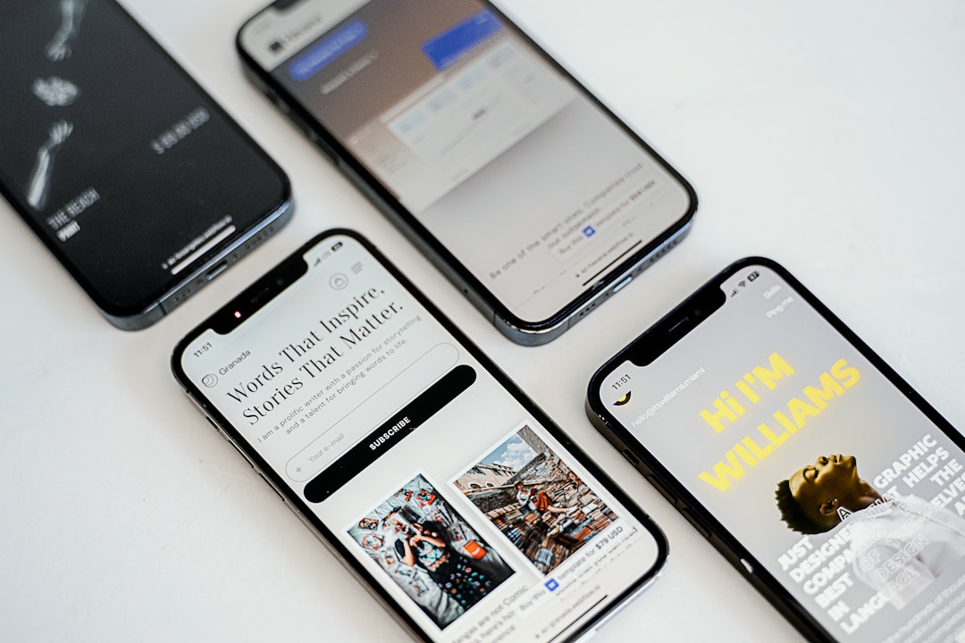
I spent hours writing responsive CSS with media queries. Flexbox for layout, fluid images, breakpoints at 480px and 768px. Everything looked great in Chrome DevTools’ device emulator. But when I tested on my actual phone, I saw a zoomed-out desktop layout. My breakpoints never triggered.
Problem
When I open my responsive website on a mobile phone, I get this:
┌─────────────────────────────────────┐│ ││ [Tiny desktop layout zoomed out] ││ ││ Text is unreadable without zooming ││ Horizontal scroll required ││ ││ My 480px breakpoint never applied ││ │└─────────────────────────────────────┘The phone shows a miniaturized version of my desktop layout. Why doesn’t my mobile-specific CSS work?
Environment
- CSS with media query breakpoints
- Testing on actual mobile device (not emulator)
- Modern smartphone browser
What happened?
I wrote a mobile-specific layout for narrow screens:
@media screen and (max-width: 480px) {  .container {    display: block; /* Single column for mobile */  }
  .sidebar {    display: none; /* Hide sidebar on mobile */  }}
In Chrome DevTools’ mobile emulator, this worked perfectly. But on my real iPhone, the desktop layout appeared—sidebar visible, multi-column layout, no mobile styling.
I opened Chrome DevTools on my phone (via USB debugging) and checked the viewport width:
window.innerWidth: 980My phone screen is only 375 pixels wide. Why does the browser report 980px?
The reason
Mobile browsers “lie” about their viewport width. They default to a 980px viewport width, rendering pages as zoomed-out desktop layouts.
MDN explains why: when smartphones first arrived, most websites weren’t mobile-optimized. Browsers rendered pages at 980px and showed them zoomed out so users could see the full desktop layout. This behavior persists today.
Actual device width: 375pxBrowser viewport width: 980px (fake!)
My @media (max-width: 480px) checks: 980px > 480px → FALSE → rule ignored
Since the browser claims 980px width, my 480px breakpoint never triggers.
How to solve it?
Add the viewport meta tag to your HTML <head>:
<!DOCTYPE html><html><head> <meta charset="UTF-8"> <!-- This tag makes responsive CSS work on mobile --> <meta name="viewport" content="width=device-width, initial-scale=1"> <title>Your Page</title></head><body> <!-- Your content --></body></html>This tag tells the browser:
width=device-width: Use the actual device screen width (375px, not 980px)initial-scale=1: Start at 100% zoom (no initial scaling)
Now test again:
┌───────────────────────────────┐│                               ││  [Proper mobile layout]       ││                               ││  Single column displayed      ││  Sidebar hidden               ││  Text readable at normal size ││                               │└───────────────────────────────┘
window.innerWidth: 375 (actual device width)My @media (max-width: 480px): 375px < 480px → TRUE → rule applies
Common Mistakes
Mistake 1: Forgetting the viewport tag entirely
This is the #1 cause of responsive sites not working on mobile. Every HTML document needs this tag.
<head> <title>My Responsive Site</title> <!-- No viewport meta tag! Mobile browser assumes 980px --></head>Mistake 2: Using accessibility-harmful values
Some old tutorials suggest user-scalable=no:
<meta name="viewport" content="width=device-width, initial-scale=1, user-scalable=no">This prevents users from zooming, which hurts accessibility. Low-vision users need to zoom text. Never block scaling.
Mistake 3: Following outdated tutorials
Early responsive design articles (circa 2010-2012) often omitted the viewport tag because it wasn’t widely known yet. Modern tutorials always include it.
Summary
In this post, I explained why responsive CSS fails on mobile without the viewport meta tag. The key point is that mobile browsers default to a 980px viewport width, so your breakpoints never trigger. Add <meta name="viewport" content="width=device-width, initial-scale=1"> to every HTML document to force mobile browsers to use the actual device width.
Final Words + More Resources
My intention with this article was to help others share my knowledge and experience. If you want to contact me, you can contact by email: Email me
Here are also the most important links from this article along with some further resources that will help you in this scope:
Oh, and if you found these resources useful, don’t forget to support me by starring the repo on GitHub!
Comments